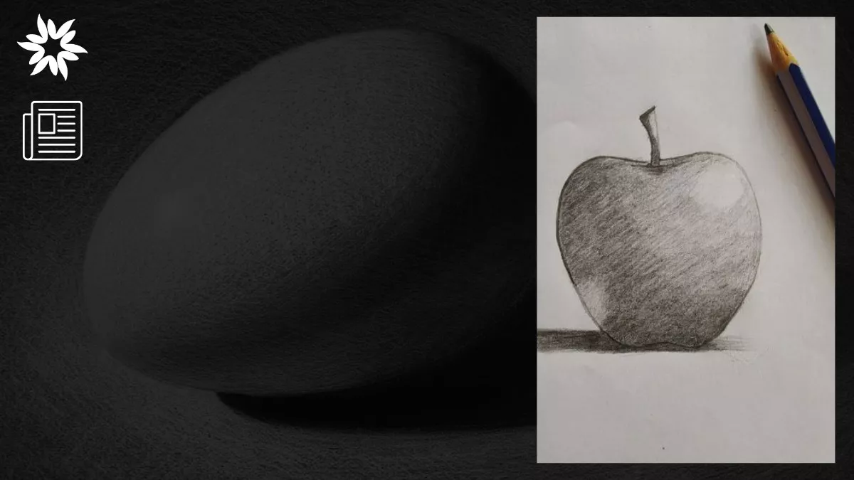
Light and shadow. Two simple elements that can take your art from flat to vibrant.
If your drawings feel lifeless, you’re not alone.
We’ve all been there—spending hours on sketches, only to wonder why they don’t pop.
Here’s the secret: it’s not always about perfect proportions or perspective (though they matter). The real magic lies in how you handle light and shadow.
The good news is that the basics of lighting are universal.
Master them, and they’ll work for everything—whether you’re sketching a sphere or a portrait.
So, let’s break it down.
We’ll explore how light and shadow work, why they’re essential, and how to use them to bring your art to life.
Grab your sketchbook (or tablet), and let’s get started!
Imagine this: You’re drawing a ball on a table. The shape is perfect, maybe even textured—but it still looks flat.
Why might that be? It’s missing volume.
To make your drawing look real, you need to know how light works.
Light creates highlights, shadows, and everything in between.
Shadows, especially, are what give depth and make your art feel grounded.
Shadows aren’t an afterthought—they follow rules, often called “light logic.”
And mastering these rules is what turns a beginner into a pro.
When light hits an object, it divides the surface into three main areas: the light side, the shadow side, and the cast shadow.
Each of these areas has its own unique characteristics that you need to capture to create realistic art.
This is the part of the object that faces the light source. It’s where you’ll find the brightest and most detailed areas of your drawing.
The light side is divided into two main components:
The shadow side is where things get dark—the part of the object that’s turned away from the light.
But it’s more than a flat area of black; it has layers and subtleties.
Here’s what to look for:
Cast shadows are the ones that appear on the surface beneath or behind the object.
They’re created when the object blocks the light, and they play a big role in anchoring your object to its surroundings.
Here’s what you need to know about them:
Shadows get their shape and style from a mix of things—the object casting them and the light shining on it play a big role in how they look.
For example, if you shine a single light on a sphere, the cast shadow will be an ellipse. Shine that same light on a cube, and you’ll get a square shadow.
And this is the predictability we call “light logic.”
The intensity of the light also matters. Strong, focused light (like the sun on a clear day) creates sharp shadows with crisp edges.
Soft, diffused light (like a cloudy sky or a lamp with a shade) creates blurry, gradual shadows.
The farther a shadow stretches from the object, the softer its edges become.
Without question, this consistency is your best friend as an artist.
It means you can predict how light and shadow will behave, even if you’re drawing from imagination.
Multiple light sources can confuse beginners by creating complex shadows that are tricky to draw.
That’s why it’s best to start with a single, hard light source—like a desk lamp or sunlight. It makes light and shadows easier to see and understand.
You can clearly spot highlights and halftones with one light, form shadows, and cast shadows.
Master this first, and you’ll be ready for the more complex setups later.
When it comes to mastering light and shadow, the humble sphere is your best friend.
Why?
Because its smooth, round surface makes it an ideal shape for understanding how light behaves.
A sphere has no sharp edges or complicated angles, so the way light and shadow interact is straightforward and easy to study.
Think of it as the “training wheels” of shading.
Start with something simple—like a rubber ball, an orange, or even a crumpled piece of paper rolled into a rough sphere.
Then, set up a single light source.
A desk lamp works perfectly because it gives you control over the direction and intensity of the light.
If you prefer natural light, position the sphere near a window on a sunny day, but avoid diffused lighting, like overcast skies, for this exercise.
Take a long look at how the light interacts with the sphere.
Notice the highlight, the brightest spot where the light hits directly.
Look for the halftones that create a smooth transition from the highlight to the darker areas.
Observe the form shadow, the softer shadow that curves along the sphere’s surface.
Finally, study the cast shadow, the shadow the sphere throws onto the surface below it.
Pay attention to how the cast shadow starts dark and sharp near the sphere and fades as it stretches away.
Now, grab your pencil and paper (or your digital stylus, if that’s your thing).
And start to sketch the sphere lightly to outline its shape.
Then, begin shading:
Pro tip: Keep the edges sharp near the sphere and softer as the shadow fades outward.
One of the most challenging parts of shading a sphere is getting the transitions between light and shadow just right.
The sphere will look flat or angular if the transitions are too harsh.
If they’re too blended, the shape may lose its definition.
Focus on creating smooth, gradual changes in tone while keeping the boundaries between light and shadow clear.
Once you’ve finished your sketch, take a step back and compare it to the actual sphere.
Does it look three-dimensional?
Are the shadows and highlights consistent with the light source?
If not, don’t worry!
Adjustments are part of the learning process. Identify what feels off and try again.
Once you’re comfortable with the sphere, it’s time to add a bit of variety.
Move on to other basic shapes, like cubes and cylinders.
Each shape will introduce new challenges:
And if you’re feeling like pushing the boat out, try shading more complex objects, such as a teapot, a vase, or even a crumpled piece of paper.
These forms will test your ability to apply the principles of light and shadow to irregular shapes.
Learning how to work with light and shadow isn’t a walk in the park. It sure can feel like you’re fighting with your pencil to make things look right.
No matter how skilled, every artist has made the same mistakes at some point.
So, here are some of the most common pitfalls when working with light and shadow—and how to avoid them.
Blending is one of the first techniques many artists learn, and it’s super useful for creating smooth transitions.
But there’s a danger: if you overblend, you can blur the line between light and shadow so much that your drawing loses clarity and contrast.
Instead of a well-defined object, you end up with something that looks hazy and flat.
How to Fix It:
It’s tempting to think of shadows as pure black and highlights as pure white, but that’s rarely how they appear in real life.
Shadows exist in a range of tones depending on the light source, the material of the object, and the surrounding environment.
If your shadows are too dark, they might overpower the rest of your drawing.
If they’re too light, they won’t give the object enough depth.
How to Fix It:
The shadow line, or terminator, is the boundary where the light side transitions into the shadow side.
It’s one of the most important features for defining an object’s shape, but it’s often overlooked.
If the shadow line isn’t clear, your drawing can look flat or confusing.
Without it, the viewer might struggle to understand where the light originates.
How to Fix It:
Okay, now that we’ve covered the basics, let’s talk about adding some flair.
Sure, lighting describes form, but it also sets the mood and tells a story.
So, think about how dramatic overhead lighting feels compared to soft, warm candlelight.
The way you light your subject can completely change how people perceive it.
Do you want to create tension? Try using harsh, low-angle lighting with sharp shadows.
Are you going for something cozy? Use diffused, high-angle lighting for a softer effect.
Experiment with different setups to see what works best for the mood you’re trying to convey.
Mastering light and shadow takes time, effort, and practice.
Start with the basics, make mistakes, and learn from them.
Every sketch—even the rough ones—helps you improve.
With practice, light and shadow will feel natural, and your art will come alive with depth and dimension.
Most importantly, enjoy the process.
Try new lighting, play with textures, and push your limits.
Grab your pencils (or stylus), find a light source, and start creating—your next masterpiece is waiting!

In January 2026, the Berkeley Art Museum and Pacific Film Archive (BAMPFA) will open a full retrospective dedicated to the…

The Biennale of Sydney will return to White Bay Power Station for its 25th edition, running from March 14 to…

Art Basel Hong Kong 2025 marks the 12th edition of the fair. It takes place from March 26 to March…